Backdoor Logo Proposal
by Andrew Callender

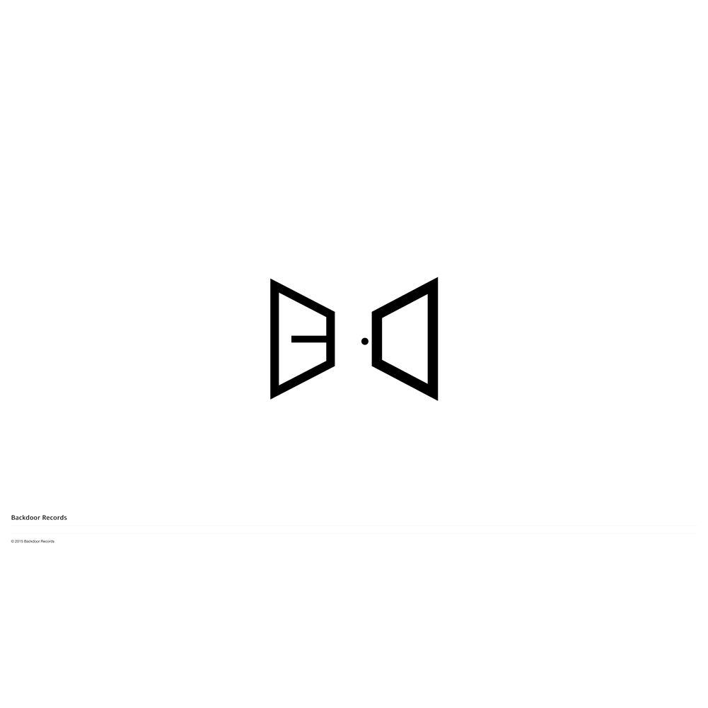
Although it has long faded from the mainstream, the record player remains one of the most iconic symbols of music and music production in the world. Therefore, it would have been ill-advised to have not used it in some form in Backdoor’s logo. While it is effective, there is a hint of cliché in using the vinyl record. A whole host of record companies use it and have been using it for many years. Backdoor
is not like all the others. In this vain, I went a step further and decided to play on the name of the company.
The open door hints at promise. Backdoor enables artists to get to their optimal level in terms of artistry so the door is a fitting analogy to represent the company. Artists walk through the backdoor to access the services.
The ‘B’ and the ‘D’ represent walls skewed in perspective. It invites the viewer in with the circle and the negative space serving as a door. This logo is ready to be used as an a icon in the Backdoor’s social media efforts. It is free from clutter. It is unencumbered by the need to tell too much of a story.