Backdoor Logo Proposal
by Brooke Hopkins

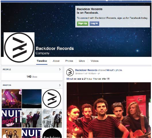
This logo incorperates the mentality and comtemporary nature through the sharp logo design. The elements are drawn from computer system symbols- the bluetooth icon and >. These symbols represent the modern and innovative image of the company. The ‘b’ in the center was inspired by the blue- tooth icon and created by the intersection of two right arrows, interspersed with negative space to give it a third dimention. This third dimention reperesents the new direction that Back- door Records is taking their artists in record producing. Ad- ditionally, the layered blocks present the stage Backdoor re- cords witll take the artists to, one way or another The clean and simple logo manifests the modern feel and pro- gressive future of the young company. The black and white keeps the image bold, yet universal, so as to incoperate all genres of music the record company may work with. The sharp edges maintain the new age look while still keeping the circle and strong look of the previous logo.