Backdoor Logo Proposal
by Ellina Nurmukhameova

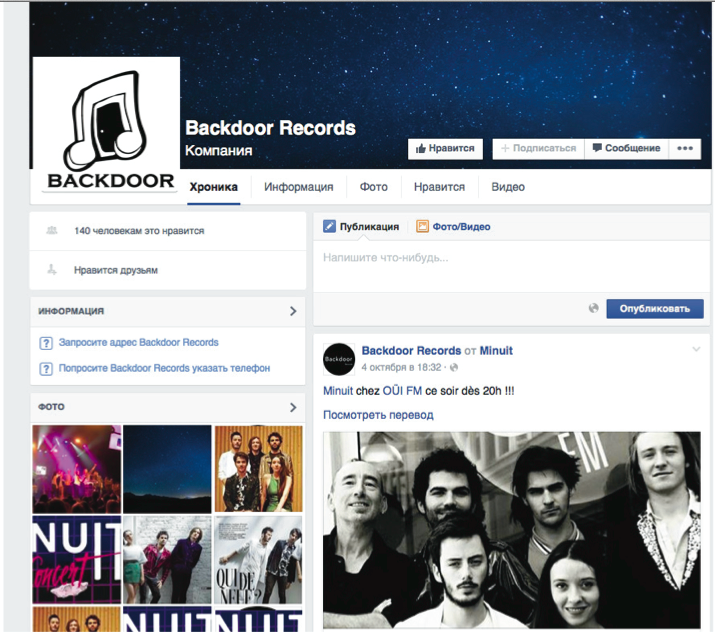
Contemporary record company needs contemporary style of the logo, that is why I decided to go with hand drawn design. The name “Backdoor” is unique and gives many opportunities for creativity. It seems that there are two words that have to be represented - back and door. However, there is also one more, the most important one, which is sound, because “Backdoor” is sound recording company, that helps artists with creating music. Having in mind all of these, I came up with the design of the logo, which gives unique representation of the company, so that it would be easily recognized by public. To represent “back”, I chose the color black, and also the door itself is not really stepping out, it is more at the back of the image. Black also maintains the previous color scheme of the company. While playing with an image only of the door I realized that it looks nice, but it does not really say that much about the company. Logo with only door in it, looks like it belongs to company that is selling doors and windows. In result, for representing “sound” I used musical note, which gives a clue that this company deals with sound and music. To represent tagline of “Blackdoor”, as well as door concept itself I placed the door inside musical note, so that Backdoor becomes a door into sound and music.
