Backdoor Logo Proposal
by Gabor Csapo

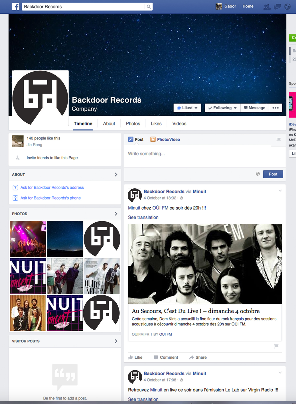
The key principle behind my design was simplicity to create an icon that is recognizable even in the smallest size on facebook. I also tried to blend the logo into the current identity of Backdoor Records, so in the end I kept the minimalistic black and white theme with a circular background frame. I like this theme because it is elegant, sophisticated, mysterious. The new logo, however, compresses three main concepts that make it specific for Backdoor Records.
First, it shows “bd”, which refer to backdoor and make it easier to connect the logo to the name.
Second, it shows the musical nature of the business the company is involved in, because the logo can be the outline of a musical note, a pair of headphones, or even a boom box.
Thirdly, I wanted to incorporate the image of a Backdoor. In the brief it was heavily emphasized that Backdoor records thinks of itself as a backdoor to the industry for artists. Therefore, I also believe it should be a central idea in the logo. The white cut in the bottom depicts a lightstream coming through a door, which is the letter “d”.