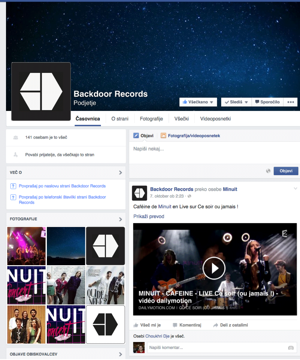
Backdoor Logo Proposal
by Miha Klasinc
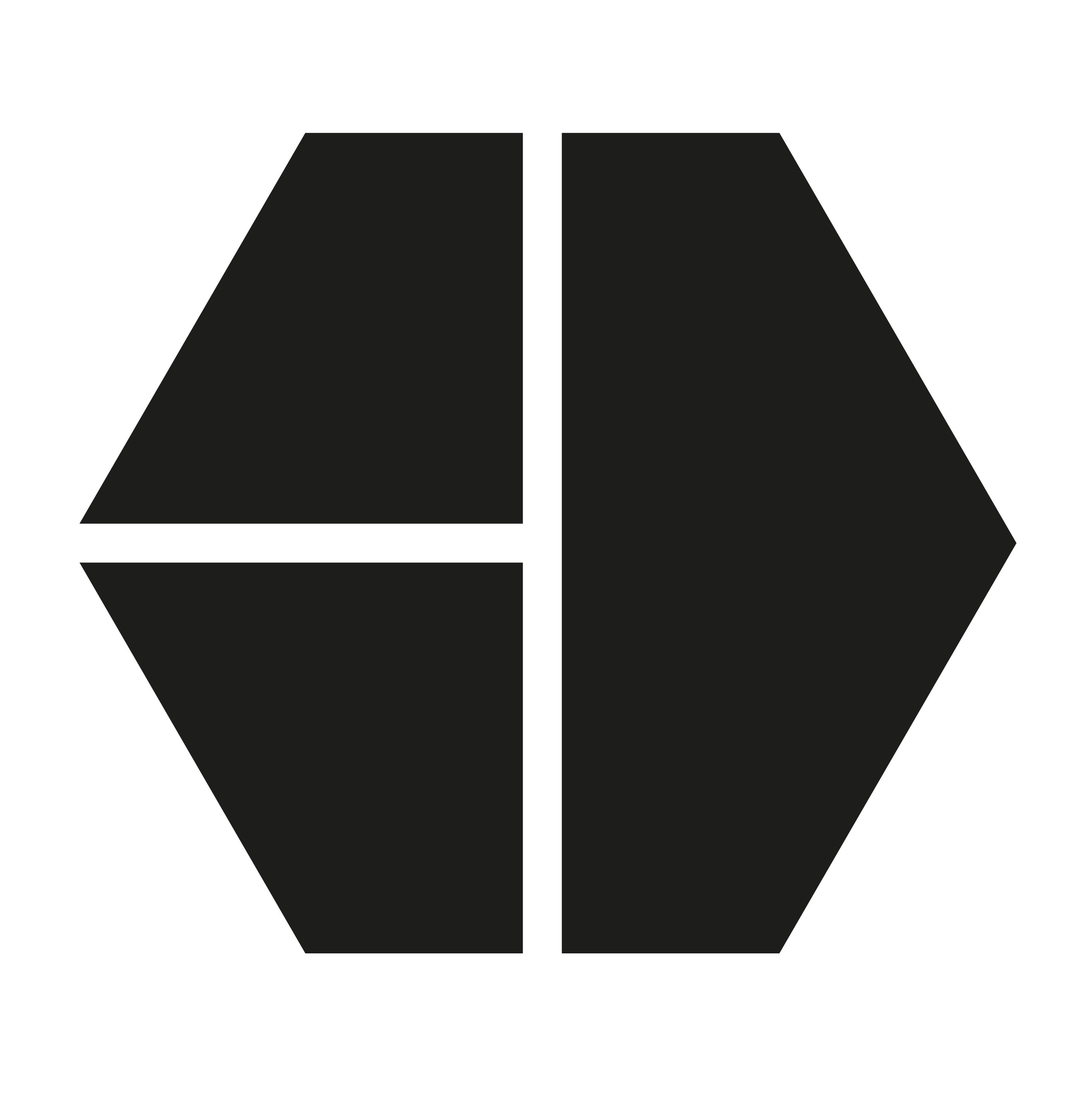
The proposed logo design features a hexagon comprised of the letters B and D. The two letters are used as an acronym for ‘Backdoor’. The letter B is reflected over its vertical axis (i.e. turned backward), and thus contains a direct reference to the client’s name. The inversion adds a sense of symmetry to the logo, while the horizontal line distinguishing B from D maintains the variety of the overall shape. Finally, the hexagon gives the logo a sharp, contemporary look.