Backdoor Logo Proposal
by Orsolya Szantho
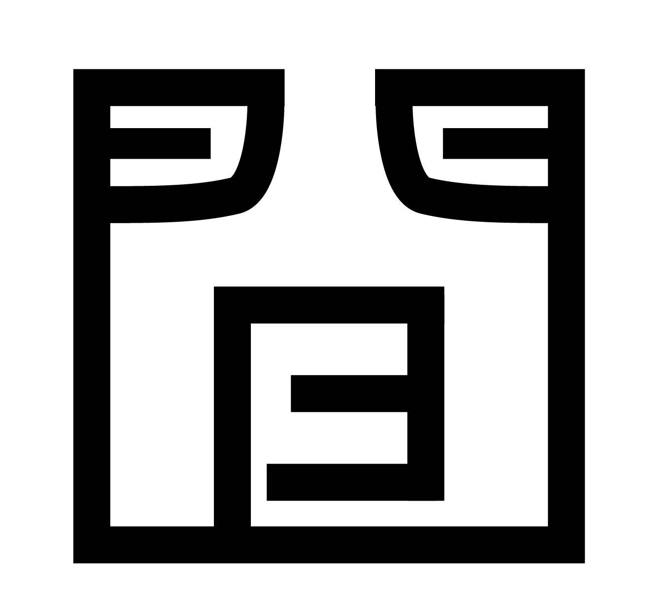
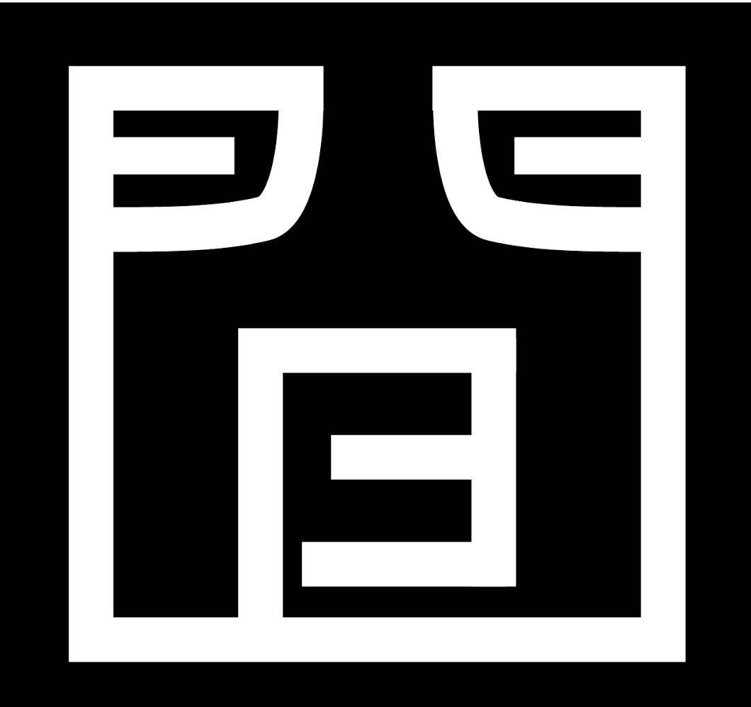
Taking inspiration from the name, Backdoor, but aiming to break with the mainstream traditions, already the first draft used the shape of a back of a person (around the neck and shoulders), and a door-like B shape (standing for the initial of the name). It was intended that these shapes should not be obvious in order to add a sense of freshness to the design. After realising the accidental similarity of the shape to the Chinese symbol 門 (meaning door), the drafts were finalised. The outcome is an icon-like logo design concept that reflects on both the mindset and name of the company.
Cunning. The logo and its parts allow for multiple interpretations. The association between the company and the concept of backdoors is created with the door-like B shape and the person’s back, as well as by using the Chinese symbol.
Determined. The mixture of straight and round lines and the balance of edges and curves creates a stable, reliable, and determined impression.
Creative. The logo’s use of shapes breaks away from the mainstream and avoids being obvious, while still being able to make use of the connotations with record labels and the association with backdoors.